How to Improve Ecommerce Conversion Rate and Boost Your Sales
Boosting your ecommerce conversion rate isn't about guesswork; it's a methodical process of finding the friction in your sales funnel and systematically testing your way to a smoother customer journey. It all starts with a hard look at your data—establishing a clear baseline, auditing your site's user experience and speed, and then zeroing in on high-impact areas like your product photos and checkout flow.
What's Really Going On With Your Conversion Rate?
Before you can even think about improving your conversion rate, you need a rock-solid grasp of what that number actually represents. Too many store owners get hung up on the simple formula: (Total Sales / Total Visitors) x 100. While that gives you a pulse, it’s a single number that hides the real story.
Think of it like a final score in a football game. Knowing you lost 21-14 doesn't tell you why. Was it a weak defense? A crucial turnover? To get better, you have to watch the game tape. That's exactly what we need to do with your site's data—break down the journey to find those make-or-break moments.
Digging Deeper Than the Basic Formula
Lumping all your visitors into one big bucket is the fastest way to miss crucial insights. The first real step is to segment your audience. By slicing your traffic into different groups, you’ll quickly see who’s buying and who’s bouncing.
Start with these three simple segments:
- New vs. Returning Visitors: It's common for returning visitors to convert at a much higher rate. If your new visitor conversions are in the basement, it could be a sign that your site isn’t building trust or clearly communicating your value on the first visit.
- Traffic Source: Are customers from your Google Ads campaigns converting better than those from your Instagram feed? This tells you where your marketing dollars are working hardest and which landing pages might need a tune-up to better match the ad's promise.
- Device Type: You absolutely have to analyze mobile, desktop, and tablet performance separately. A low mobile conversion rate is a massive red flag, often pointing to a clunky interface or slow load times that are frustrating shoppers on the go.
How Do You Stack Up? Setting Realistic Benchmarks
It’s also crucial to know where you stand in your industry. A "good" conversion rate is completely relative. An online store selling $5,000 custom furniture will naturally have a lower conversion rate than one selling $15 novelty t-shirts.
A common myth is that every store should be shooting for a 5% conversion rate. The truth is, performance varies wildly between niches. Your goal shouldn't be to hit some arbitrary industry number, but to see consistent, meaningful growth against your own baseline.
Just look at the massive differences in average conversion rates across different ecommerce sectors.
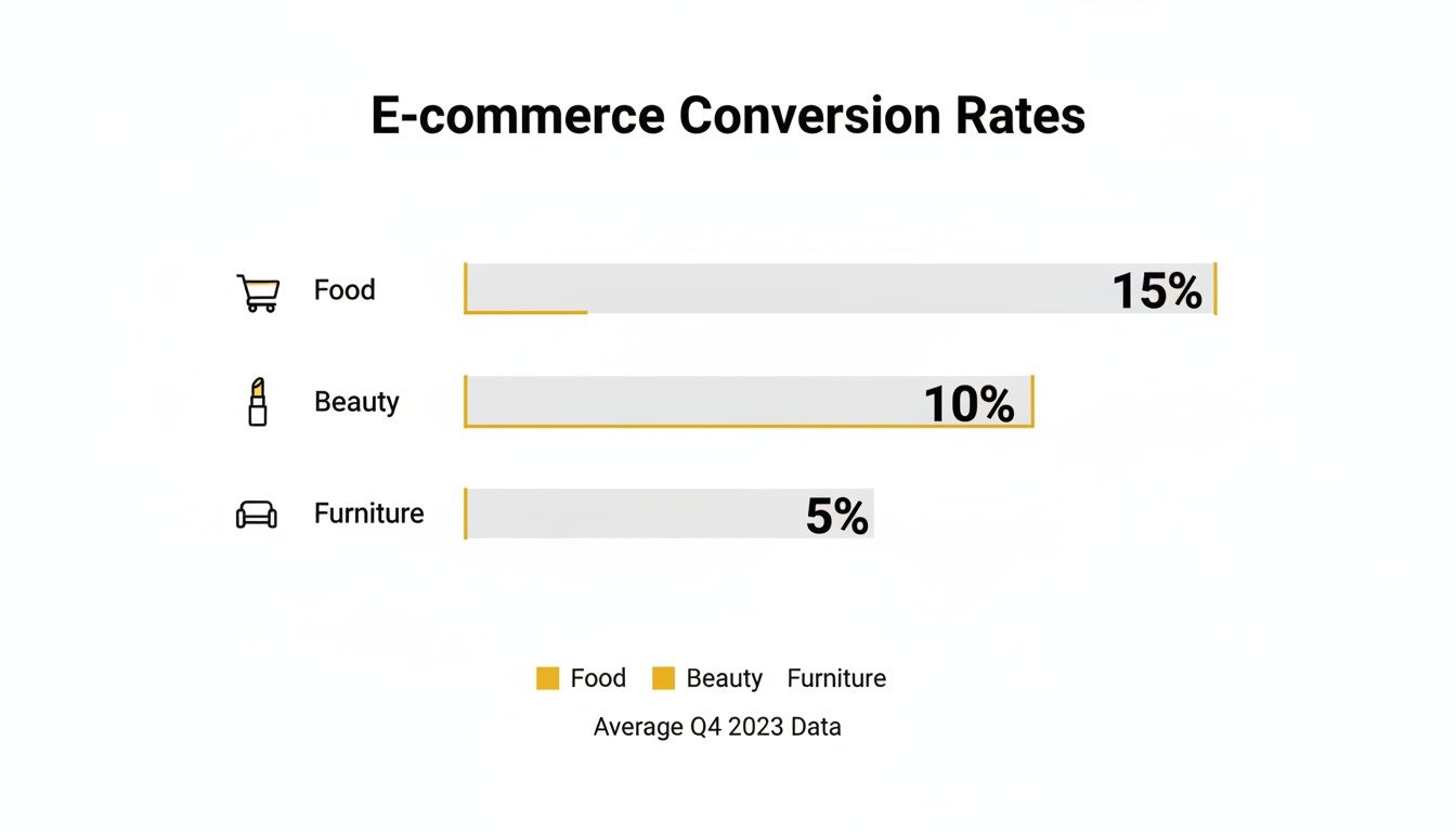
The data here is eye-opening. A 2% conversion rate might feel disappointing for a beauty brand, but it would be phenomenal for a furniture store. According to recent reports, food & beverage leads the pack at an average of 6.22%, with beauty & personal care not far behind at 4.94%. Meanwhile, home & furniture sits at a much lower 1.41%. The global average hovers around 2.95%. You can discover more insights about global ecommerce benchmarks to see how you compare.
Find the Leaks by Tracking Micro-Conversions
Finally, remember that improving your main conversion rate is really about optimizing all the small steps that lead to a sale. These are your micro-conversions—smaller actions a user takes that show they're moving in the right direction, like adding an item to their cart, signing up for your newsletter, or creating an account.
To truly understand your store's performance, you need to track a handful of key metrics that paint a complete picture of your sales funnel. These numbers will help you pinpoint exactly where potential customers are dropping off.
Key Conversion Rate Metrics You Must Track
| Metric | What It Measures | Why It's Important |
|---|---|---|
| Add to Cart Rate | The percentage of visitors who add at least one product to their shopping cart. | A low rate often points to issues with product pages, such as poor descriptions, weak photos, or confusing pricing. |
| Checkout Initiation Rate | The percentage of visitors who start the checkout process after adding items to their cart. | If this number is low, it could signal that unexpected shipping costs or required account creation are scaring people away. |
| Cart Abandonment Rate | The percentage of shoppers who start the checkout process but do not complete the purchase. | A high rate here is a major red flag, often caused by a complicated checkout flow, lack of payment options, or technical glitches. |
| Average Order Value (AOV) | The average dollar amount spent each time a customer places an order. | Increasing your AOV through up-sells and cross-sells is one of the fastest ways to boost revenue without needing more traffic. |
| Customer Lifetime Value (CLV) | The total revenue a business can reasonably expect from a single customer account throughout the business relationship. | This metric shifts your focus from a single sale to building long-term, profitable relationships with your customers. |
By monitoring these smaller steps, you can stop guessing and start making targeted fixes. If tons of people are adding to their cart but not starting checkout, the problem isn't your product—it's likely something happening on the cart page itself. This is how you find and plug the leaks in your funnel.
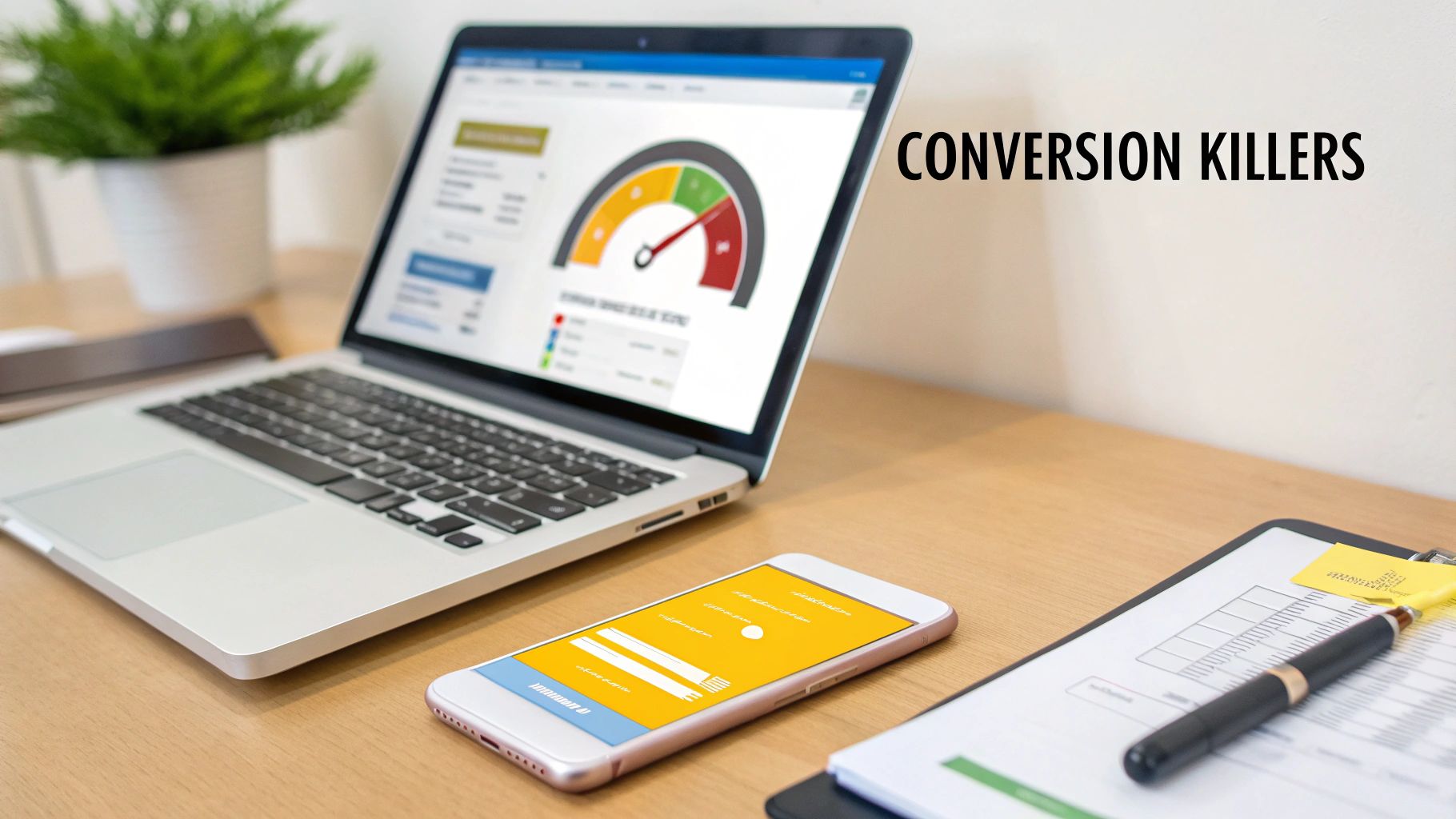
Time to Hunt for Conversion Killers on Your Site
Once you've got a handle on your core metrics, it's time to put on your detective hat. I can almost guarantee your website is hiding a few "conversion killers"—those subtle friction points that frustrate visitors and quietly sabotage your sales. Finding them is the first step to turning things around.
This isn't about blowing up your budget on a massive redesign. It’s about a targeted, surgical audit to find the specific roadblocks tripping up your customers. We're going to focus on three critical areas: what your customers are actually experiencing, how fast your site loads, and what it’s like to shop on a phone.
See Your Store Through Your Customers' Eyes
Let’s be honest: you’re too close to your own website. You know exactly where to click and what every button does, but your customers are coming in cold. To find the real friction points, you have to see your store through their eyes. Thankfully, modern tools make this surprisingly easy.
Session recordings and heatmaps are your secret weapons here. Tools like Hotjar or Microsoft Clarity let you watch anonymized recordings of real user sessions. You get to see where their mouse hovers, where they hesitate, and the exact moment they give up and leave. It can be a little painful to watch, but it's incredibly insightful.
I like to think of heatmaps as an X-ray of my website's performance. They show you which buttons get ignored, which sections are completely overlooked, and where people are "rage clicking" in frustration. This isn't just abstract data; it's a visual story of user behavior that points directly to your biggest opportunities.
By watching just a handful of these recordings, you'll spot issues you never would have noticed. Maybe a crucial button is hard to see on certain screen sizes, or a pop-up is impossible to close. These are the quick wins that can have a massive impact on your conversion rate.
Diagnosing Your Need for Speed
In ecommerce, speed isn't a feature—it’s a prerequisite. Even a one-second delay in page load time can cause a significant drop in conversions. Shoppers are impatient, and a slow-loading site just feels unprofessional and untrustworthy.
Your audit has to include a thorough speed test. You can use free tools like Google's PageSpeed Insights to get a detailed performance report for both desktop and mobile. This tool will diagnose specific problems, like:
- Huge Image Files: This is the usual suspect. Uncompressed product photos can grind your site to a halt.
- Bloated Code: Unnecessary scripts, plugins, or clunky apps can add precious seconds to your load time.
- Slow Server Response: This often points to an issue with your hosting provider that might require an upgrade.
Fixing these is a bit technical, but it's absolutely crucial for improving your ecommerce conversion rate. Start by compressing your images—this alone can make a world of difference. From there, work through the recommendations from your speed test and prioritize the fixes that promise the biggest performance gains. A faster site immediately creates a better user experience and builds the confidence someone needs to click "buy."
Mastering the Mobile Shopping Journey
Finally, your audit needs a laser focus on the mobile experience. People aren't just browsing on their phones anymore; they're completing entire purchases. A clunky, hard-to-navigate mobile site isn't just an inconvenience—it's a direct path to lost revenue.
Optimizing for mobile is a huge opportunity. Interestingly, tablets actually lead with a 3.1% conversion rate, beating desktops at 2.8% and smartphones at 2.3%. Yet, poor mobile optimization is a leading cause of cart abandonment. This is staggering: 53% of users will abandon a site that takes more than three seconds to load on their phone. You can discover more statistics on ecommerce performance and see why a mobile-first approach is non-negotiable today.
Pull out your own smartphone and go through your site. Seriously, do it right now.
Can you easily read the text without pinching and zooming? Are the buttons large enough for your thumb to tap accurately? Is the checkout process simple, or does it force you to type endlessly into tiny form fields? Every extra tap, every moment of confusion, is a reason for a mobile shopper to bail. Your goal is a seamless, thumb-friendly journey that makes buying from you on the go feel completely effortless.
Elevating Product Pages with AI-Powered Imagery
Let's be blunt: your product images are your best salesperson. In ecommerce, customers can't touch, feel, or try on anything. Your visuals have to do all the heavy lifting, acting as a digital handshake and the single biggest factor in whether someone clicks "Add to Cart."
Mediocre photography isn't just unimpressive; it actively hurts you. Grainy, poorly lit, or single-angle shots scream unprofessionalism and create doubt. A shopper needs to see your product from every possible angle, zoom in on the stitching, and, most importantly, picture it in their own life.
This means you need a solid mix of high-quality visuals, no exceptions:
- Studio Shots: Clean, crisp photos on a neutral background that put all the focus on the product's features.
- Lifestyle Images: Photos showing the product in a real-world setting. This is crucial for helping shoppers imagine how it fits into their day.
- Detailed Close-ups: Shots that highlight texture, materials, and quality craftsmanship. This is how you build trust.
- Product Video: A quick clip of the product in action can clear up questions and crush uncertainty far better than static images ever could.
The New Frontier: AI-Generated Product Photography
For years, getting that full suite of visuals meant expensive, time-sucking photoshoots. But now, AI is completely changing the game. Brands of any size can produce stunning, studio-quality imagery at a tiny fraction of the cost and time. This is a massive leap forward in how to improve ecommerce conversion rate, especially for stores without a huge budget.
Tools like PhotoMaxi are leading this charge. Forget about hiring models, booking studios, and dealing with logistical headaches. You can use AI to generate an endless stream of on-brand, photorealistic images. It’s not just about saving money; it’s about unlocking creative potential that was once completely out of reach.
You can instantly place your product anywhere—a minimalist Scandinavian living room, a sun-drenched beach in Bali, you name it. You can generate diverse AI models wearing your clothing, ensuring your brand connects with a global audience. The level of creative control and consistency is a true game-changer.
This kind of platform gives you a scalable alternative to traditional photography, no matter the size of your business. It's about creating custom scenes and models on demand.
Practical AI Applications That Actually Drive Conversions
This technology is so much more than a way to create pretty pictures. It directly tackles common customer hesitations and friction points, giving shoppers the visual proof they need to buy with confidence.
Scenario A: The Fashion Retailer
A Shopify store selling jackets was struggling with inconsistent model photos from different shoots.
- The Problem: The brand felt disjointed, and customers couldn't get a good feel for the fit across the product line.
- The AI Solution: They used an AI image generator to create a consistent "brand model." Then, they generated images of her wearing every single jacket from multiple angles and in different lifestyle settings (like rainy city streets or a crisp autumn day).
- The Result: The product pages now look cohesive and professional. Customers can see exactly how each jacket fits on the same person, which led to a measurable drop in returns and a serious lift in their add-to-cart rate.
Scenario B: The Home Goods Store
A small business selling handmade ceramic mugs wanted to show them in cozy home settings but couldn’t afford lifestyle shoots.
- The Problem: Their simple white-background photos failed to capture the warm, artisanal vibe of their brand.
- The AI Solution: They uploaded their existing product photos into an AI tool. Within minutes, they had dozens of new images showing the mugs on rustic kitchen counters, modern office desks, and next to a roaring fireplace.
- The Result: The new imagery helped customers immediately visualize the products in their own homes, which boosted engagement and sales. They could even A/B test different scenes to see which ones resonated most.
AI-powered imagery isn't about replacing creativity; it's about scaling it. It lets you test visual hypotheses fast. Does this product sell better in a bright, airy setting or a dark, moody one? Now you can find out without the overhead of a full photoshoot for every idea.
By leaning into AI, you can create a richer, more informative, and visually compelling shopping experience. You end up answering customer questions before they even ask them, building trust through quality visuals, and giving shoppers the confidence they need to finally click "Buy Now." If you want to explore this further, you can learn more about how an AI product photo generator can completely transform your store.
Streamlining Your Path to Purchase
So, a customer loves your product, adds it to their cart, and heads to checkout. This is the moment of truth. But all too often, this is where the sale falls apart. An almost unbelievable 70% of shopping carts are abandoned right at this final hurdle.
The reason? It's rarely about the product itself. The real killer is a clunky, confusing, or untrustworthy checkout process.
Your job here is simple: make it as easy as humanly possible for someone to give you their money. Every extra click, every confusing form field, every surprise fee is just another reason for them to bail. Nailing this final step is one of the fastest ways to see a real, tangible lift in your sales.

Eliminate Friction and Surprise Costs
If you remember one thing, make it this: the number one reason for cart abandonment is unexpected costs. A shopper has already mentally agreed to the price they saw on the product page. When shipping, taxes, and other fees pop up at the last second, it feels like a bait-and-switch. Trust is broken instantly.
The solution is radical transparency. Show all costs upfront. Put a shipping calculator on the product page or in the cart itself. Never, ever wait until the final payment screen to reveal the real total.
Another huge point of friction is forcing people to create an account. I get it, you want their email for marketing. But for a first-time buyer, it's a major roadblock.
Always offer a guest checkout option. It sends a clear message: you respect their time and want to get them their product, not just harvest their data. You can always invite them to create an account on the "Thank You" page after the sale is locked in.
Designing a Checkout Experience That Converts
Think of your checkout page as a single, focused conversation. The design should guide the customer smoothly toward that final "Complete Order" button without any distractions.
Here’s a practical checklist for building a high-converting checkout flow:
- Offer Multiple Payment Options: Don't just assume everyone has a Visa. Integrating digital wallets like Apple Pay, Google Pay, and PayPal is a must. These can speed up the process dramatically. Also, consider "Buy Now, Pay Later" services like Afterpay or Klarna, which are huge conversion drivers for many brands.
- Keep Forms Minimal: Only ask for what you absolutely need to fulfill the order. Use tools like address auto-fill to cut down on typing and potential errors. It's a classic story, but it's true: Expedia famously boosted profits by $12 million just by removing a single, unnecessary field from a form.
- Show Progress Clearly: A simple visual progress bar (like Shipping > Payment > Confirm) works wonders. It tells customers exactly where they are in the process and how close they are to the finish line. This cuts down on anxiety and the feeling of being stuck in an endless loop of forms.
Building Trust When It Matters Most
When a customer lands on the payment page, their security senses are on high alert. They're about to type in sensitive financial information, and any hint of sketchiness will send them running for the hills.
This is where visual cues become your best friend.
Place trust badges and security seals where people can't miss them. Logos from Norton, McAfee, or the Better Business Bureau create an instant sense of safety. Even something as simple as displaying the logos of the payment methods you accept (Visa, Mastercard, Amex) reinforces that you're a legitimate business.
By focusing on transparency, convenience, and trust, you can turn your checkout from a leaky bucket into a powerful conversion machine. For more ideas on using tech to sharpen your marketing, check out our guide on the top AI tools for marketing teams and see how you can apply these same principles of efficiency across your entire funnel.
Building Trust Through Social Proof and Personalization
Once you’ve nailed your product photography and made checkout a breeze, the next real lever you can pull is trust. In a sea of online stores, shoppers are cautious. They're constantly looking for signs that you're the real deal, that your products are as good as you say they are, and that other people think so, too.
This is where social proof and personalization come into play. Social proof acts as a powerful validator, showing new customers that others have shopped with you and loved it. Personalization then makes that shopper feel seen and understood, turning a generic visit into a bespoke shopping trip. Together, they're a knockout combination for building confidence and driving sales.
Harnessing the Power of Social Proof
Think of social proof as the digital version of a friend's recommendation. People are hardwired to follow the lead of others. For your store, this means strategically weaving authentic customer feedback into the shopping experience.
The most powerful social proof is placed right where it matters most: on your product and checkout pages. When a customer is hesitating, a glowing review or a photo from a happy buyer can be the final push they need to click "Add to Cart."
Here are a few essential types of social proof you should be using:
- Customer Reviews and Ratings: This is table stakes for any ecommerce store. Make star ratings impossible to miss near the product title, and feature detailed written reviews further down the page.
- User-Generated Content (UGC): Encourage your customers to share photos of your products in action on social media. Create a unique hashtag, and then showcase those real-world images directly on your product pages. It’s authenticity you just can't fake.
- Testimonials and Case Studies: If you sell higher-priced items or B2B products, a detailed testimonial can be incredibly compelling. Pull out the most impactful quote and feature it prominently.
I always tell my clients to put their best, most descriptive review right below the main product image. A shopper shouldn't have to hunt for validation. Making that social proof visible the moment they land on the page instantly calms purchase anxiety.
Remember, the quality of your own visuals sets the tone. If you're encouraging customers to share photos, your main product shots need to set a high bar. Check out our guide on how to take better product photos to make sure your entire visual strategy is locked in.
Types of Social Proof and Their Impact
Not all social proof is created equal. The key is to use the right type in the right place to nudge the customer along their journey. Here’s a quick breakdown of common tactics and where they pack the biggest punch.
| Type of Social Proof | Best Use Case | Potential Conversion Lift |
|---|---|---|
| Customer Reviews | Product Detail Pages, Category Pages | 15-25% or more |
| Star Ratings | Product Listings, Google Shopping Ads | Increases Click-Through Rate |
| User-Generated Photos | Product Pages, Social Media Feeds | Up to 2.4x engagement |
| Expert Endorsements | Homepage, "About Us" Page | Builds brand credibility |
| "Best-Seller" Badges | Product Listings, Category Pages | Creates urgency and FOMO |
| Real-Time Popups | Throughout the Site (e.g., "Jane just bought...") | 5-10% for specific actions |
Using a mix of these elements across your site creates a powerful and layered trust-building experience that can significantly move the needle on your conversion rates.
Making Every Experience Personal
If social proof tells a customer they're in good company, personalization tells them the store was built just for them. It’s all about using what you know about a customer—their browsing habits, past purchases, even what they've clicked on—to create a more relevant and seamless shopping journey.
This goes way beyond simply adding their first name to an email. True personalization anticipates what a shopper wants before they even know they want it, surfacing products they’re genuinely likely to love. It makes the discovery process fun, not frustrating.
Simple Personalization Tactics with Big Returns
You don't need a massive budget or a team of data scientists to get started. Many powerful personalization tactics can be implemented with tools you might already have in your ecommerce platform or email marketing service.
A great place to begin is with personalized product recommendations. You’ve seen these everywhere: "You might also like..." or "Frequently bought together." These features use simple algorithms to analyze shopper behavior and suggest relevant items. It's an effortless way to increase your Average Order Value (AOV) while also improving the customer experience.
Another fantastic tactic is behavioral email marketing. This involves setting up automated emails that trigger based on what a customer does (or doesn't do) on your site. For instance, if someone browses your "running shoes" category several times without making a purchase, you can send a follow-up email featuring new arrivals or a special offer on running gear.
This kind of targeted outreach shows you're paying attention and delivering real value, not just blasting out generic promotions. In fact, these highly focused strategies are why some paid channels can boost conversion rates by 5.3x to 40x. It's proof that a little bit of personalization goes a very long way.
Frequently Asked Questions

Let's tackle some of the most common questions we get from ecommerce store owners who are ready to turn more of their website visitors into happy customers.
What Is a Good Ecommerce Conversion Rate?
This is the million-dollar question, and the honest answer is: it depends. You'll see a general average of around 2-3% thrown around, but that number is pretty much useless without context.
Some niches, like food and beverage, can hit conversion rates north of 6%. On the other hand, if you're selling high-ticket items like custom furniture, seeing a rate closer to 1% is completely normal and can be incredibly profitable.
My advice? Stop chasing a universal number. Instead, benchmark against your direct competitors and, more importantly, against your own past performance. A lower conversion rate with a sky-high average order value (AOV) often beats a high conversion rate with a tiny AOV every day of the week.
How Quickly Can I See an Improvement in My Conversion Rate?
The timeline for seeing results really hinges on what you're changing. Some tweaks give you near-instant feedback, while bigger projects require a bit more patience.
Quick Wins (A few days to a week): Small but mighty changes can move the needle fast. Think about rewriting a call-to-action button, adding a few trust badges to your checkout, or pinning a powerful customer review to the top of a product page. You can often see a measurable lift in just a few days.
Major Initiatives (A few weeks to a month): If you're undertaking a full checkout redesign, overhauling your site's navigation, or rolling out AI-generated imagery across your catalog, you'll need more time. It might take a few weeks to a month to gather enough data to know for sure if the change worked.
The key is to be methodical. Test one significant change at a time so you can clearly attribute the win (or loss) to that specific action.
The biggest mistake I see is when brands roll out ten changes at once. If conversions go up, you have no idea which change was responsible. Be methodical, test one variable, and learn from the results before moving on.
What Single Change Has the Biggest Impact on Conversions?
If I had to pick just one thing, it would be this: upgrading your product photography. It consistently delivers the highest return for just about every store I've worked with.
Think about it—your customers can't touch or feel the product. Your images have to do all the heavy lifting. High-quality visuals, including multiple angles, lifestyle shots, 360-degree views, and even short product videos, are what build the desire and confidence a shopper needs to click "buy."
Coming in at a close second is simplifying your checkout process. Every field you remove, every click you eliminate, is a direct strike against cart abandonment.
How Can AI Help with Conversion Rate Optimization?
AI has become a massive asset for CRO, going way beyond just crunching numbers. It's now a creative partner that can actively improve the customer's journey.
For instance, AI tools can generate hyper-realistic product photos and even virtual try-on experiences, giving you incredible visual assets without the time and expense of a traditional photoshoot. AI-powered personalization engines can also watch a customer's behavior in real-time and serve up product recommendations that feel genuinely helpful, not creepy.
On top of that, smart chatbots can provide 24/7 support, answering the simple questions that might otherwise cause a shopper to leave. AI can even analyze user sessions to spot friction points you might have missed, pointing you directly to the fixes that will make the biggest difference.
Ready to transform your product visuals and give your conversion rate a serious boost? With PhotoMaxi, you can generate unlimited studio-quality images, create consistent on-brand visuals, and launch virtual try-ons without the cost and complexity of photoshoots. Start creating for free today at photomaxi.com.
Ready to Create Amazing AI Photos?
Join thousands of creators using PhotoMaxi to generate stunning AI-powered images and videos.
Get Started Free